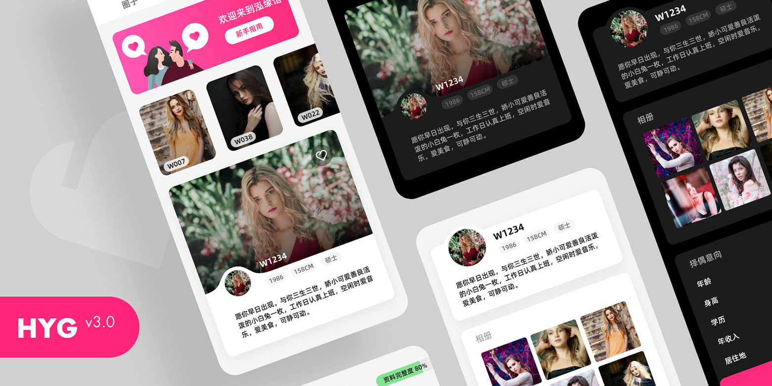
HYG V3 Updates

Around two years ago, I took over this project and was responsible for the UI design and frontend development since then. I've designed a version called v2.0 before, but it's just semi-finished. So at the end of 2019, I decided to make a whole new design as well as rewrite the code in React instead of Vue.
Abstract
The original project was based on Vue 2, for better development, I spent around one month to redesign and recode everything from ground up in React. To save time, I used the package of Umi + Ant Design + Ant Mobile + Dva.
- Whole New Design - I redesigned every single page。
- New Code Base - Mainly used React, Dva and Antd UI Components.
- Dark Mode - I Followed the guide from CSS-Tricks to implement the Dark Mode. I've already used Styled Components for several React projects and what impressed me is it can make the file structure more distinct, just like Vue's single file structure.
Design
I wanna talk this part like a seasoned web designer, however, I don't even know the color design principle.😅 Thus, I cannot tell you why I apply this color or that layout. What always prompts me to do design stuff is quite simple - I just like it! This is what I want! Besides, I enjoy playing with new things and partly know a little coding stuff.
Thanks to Remix Icon for offering such concise and practical icons.
Code
This is not a complicated project, including 11 pages which are Login, Logout, Forget Password, Home, Me, Flipped, Search, Profile, User Detail, Verification, File Uploads.
The homepage uses react-swipeable-views to aggregate the common used features, and the Popup Filter is also integrated into the Tab button to save more space. And that is inspired by the Zhihu APP. However, there is a bit of lag in switching Tabs on the real device, maybe my iPhone 6SP should retire, but considering that the next version will be launched with the new section called "circle", if the lag is more serious, I'll think over to customize a Tab component with virtualization.
The user card list uses the ListView from Ant Mobile. I think it used a virtual list technique? I haven't dig deep into that, but the actual experience seems to be smooth. There is another problem that some user cards will not update the view on the theme switch. It might be related to virtualization and is ready to be improved in the next version.
Another expected function is to remember the scroll position, so that it can return to the current browsing position when the user comes back from other pages. Fortunately, ListView provides an onScroll API, but when ref is an object, it will not trigger view update. Instead of applying the useCallback according to the official document, I used requestAnimationFrame to reposition in useEffect. I have no idea about the difference in performance, but from the intuitive feeling of page switching, there is an obvious white screen flashing when routing to other page with useCallback while the transition with requestAnimationFrame is smoother.
Conclusion
This is a project without Party A and Deadline, I have the full control over design and code, just like doing my own project. So it's quite a free and pleasant experience.
See you next version.